Universal design of presentations and slides - Kunnskapsbasen
Universal design of presentations and slides
Norwegian version: Universell utforming av presentasjoner og lysbilder
Universal Design is secured through structure and predictability in learning resources. That requires, among other things, that all presentations have a layout that is easy to read and understand.
Universal design requirements
Text: Use fonts without serifs that are easy to read. Font size should be at least 28 for content and at least 32 for headings. Avoid block letters, italics and underline, as this makes readability poor.
Structure: Utilize the preset headings and formats, without changing the order of the elements, to safeguard the users of screen reader programs. Write in short sentences and do not use mote than 4-5 bullet points in each slide.
Colors: Secure good contrasts by using dark text on light backgrounds. Avoid patterns or pictures as backgrounds for text.
Illustrations: When using graphic elements, these should be given at least half the slide, and are always to be marked with alternative text. Do not use more than two illustrations per slide and be modest with visual effects.
Notes: Please use the notes/comments-section to note what you want to say and prioritize the visual impressions in the slides.
Printing: Make sure the readability is cared for when printing.
Accessibility in PowerPoint: Microsoft Office 10 and Office 365
Available templates
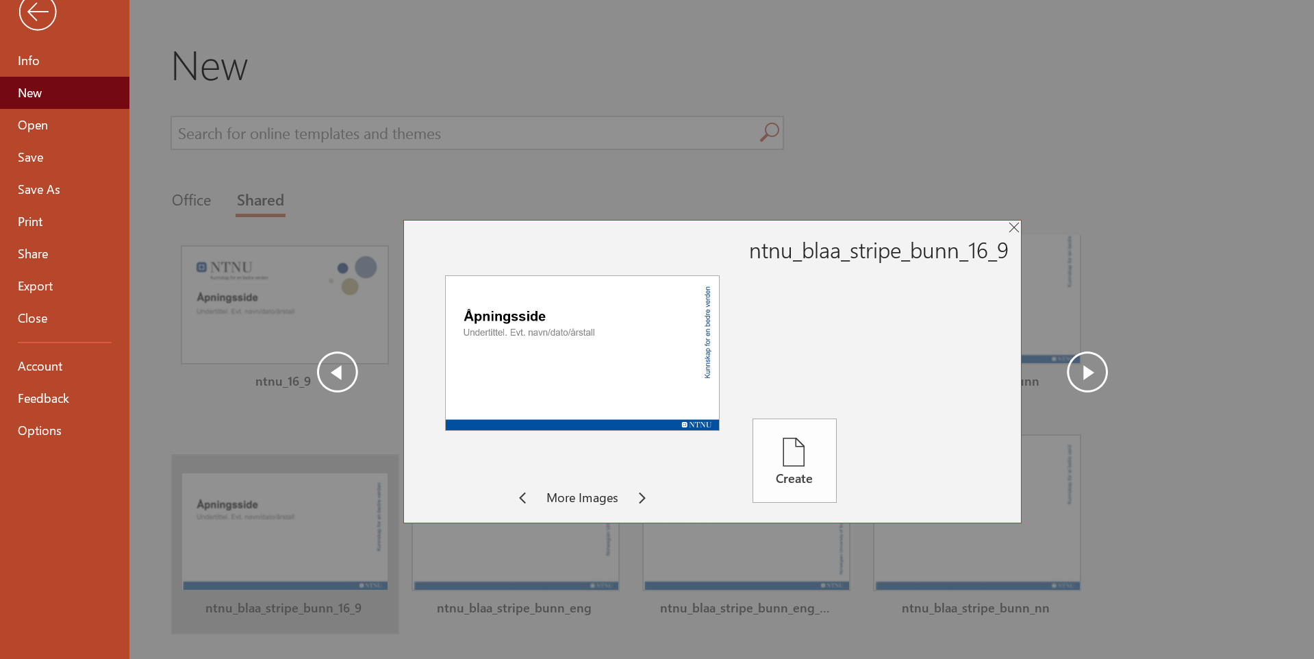
When you open Microsoft PowerPoint, you get the option to chose different templates for your presentation. As an NTNU-employee you should find these templates under the heading “Shared”.
Chose a fitting template and click “Create”.
Read more about NTNUs templates here.
By using the preset color- and text-choices in Office themes and templates, you fulfil many of the requirements of Universal Design. NOTE that NTNUs templates are not fully universally designed and you still need to check their accessability before publishing them.
When the presentation is created
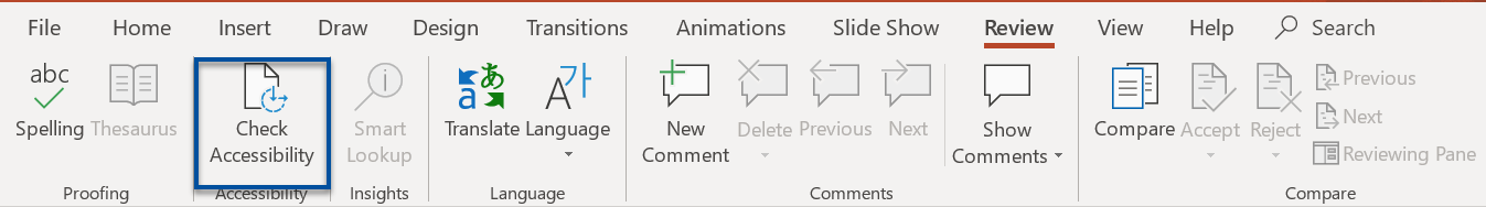
Click “Review” in the toolbar, then “Check Accessibility”.
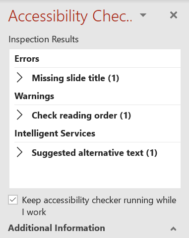
By clicking this, the Accessibility Checker is activated. This can be opened from the beginning to be activated during your work, or you can use it as a quality check as you finish your presentation.

The Inspection Results shows errors, warnings and tips for bettering the design of your presentation. To a certain degree, it offers advice for changes, but it is recommended that you have made yourself familiar with the best practice for Universal Design.
Accessibility Checker
Title: Unique titles for each slide (if wanted, the heading can be hidden by placing it outside the slide and will still be read by the screen reader programs).
Orders: Standardized orders of the content (reading order for screen reader programs). It is recommended to utilize the preset slide-layouts (templates) which automatically adapt the content in reading order.
Colors: The accessibility control checks the contrast of slide colors, backgrounds, highlighting, text boxes, header and footer, links etc. Note: Even though the Accessibility Checker is pleased with the contrasts, keep in mind that colors on text should not be your only way of communicating a message. Think about the needs of the visually impaired and color blind.
Video: Is to include a soundtrack which explains the content for the visually impaired, and texting for those with reduced hearing.
Alternative text
Captions/Alternative text can be added to all pictures and illustrations in Office. This can be edited through the tool “Edit alternative text” when right-clicking the illustration.
Tips for the execution
- Always wear a microphone, even in front of a small audience. Do not ask if it is okay for them if you speak without it. The audience should not have to broadcast their needs in front of the crowd.
- Pay attention to those with poor sight by reading all text on the slides.
- Describe what you point at so everyone can understand. Do not point silently or say “here” as an explanation.
- Describe the content of pictures and tables orally. This also goes for videos if they are not texted and visually interpreted.
- Speak clearly and calmly, and repeat questions from the audience if they are not using a microphone.
- Face the audience and be mindful of how the lighting affects lipreading. This gets easier for the audience the more light is on you.
How NTNUers do it
Paula Rice, Institute for International Business, has made sure that her presentations are fully assessable for all her students. To make sure that her PowerPoints are more easily readable for everyone, but especially for students who may have neurodiversities like Dyslexia, she changes the background color from white to a softer pastel color. Using a softer background color and a colored text makes this easier to read for students with neurodiversities that affect reading and writing. This small change makes a big difference to students who need it.

Here you see an example slide. Paula has used a light blue background and dark red text.
Contact
Contact the Section for teaching, learning and digital services (SLD) for help with digital teaching through NTNU Help.